Problem area(S)
Behavioural Insights used
Special Thanks To
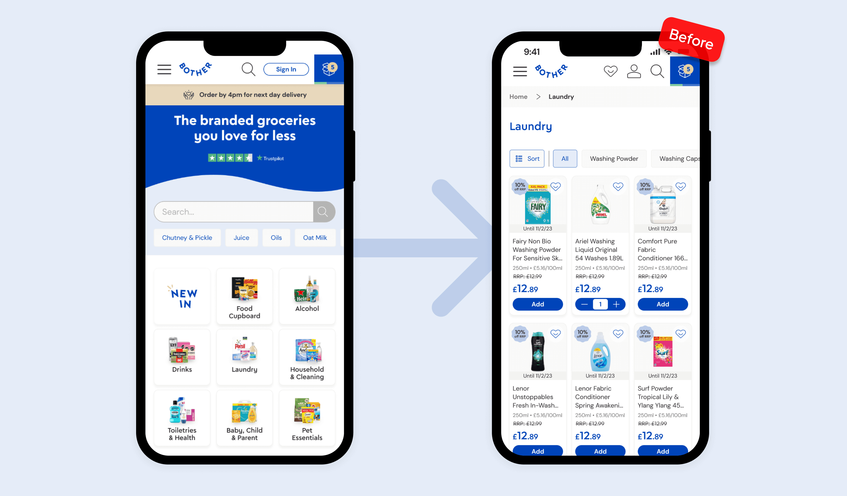
Problem
Despite the large product range, customers struggled to find the products they were looking for — leading to frustration and missed conversions.
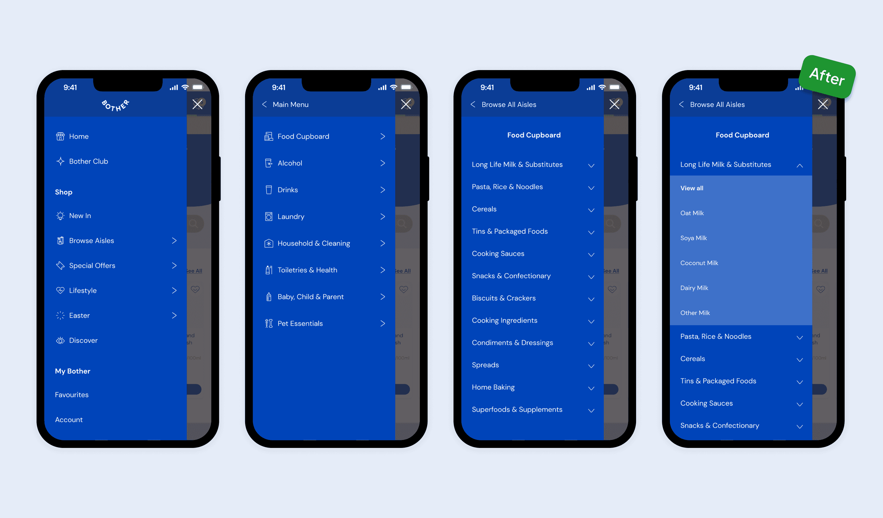
Solution
I designed an intuitive horizontal mega-menu for desktop and added easy access points throughout the site to an improved side-nav on mobile — improving category and product discoverability.
Results
Survey score of users who “strongly agree” they could find what they needed rose from 29% to 37%, and site-wide conversion improved from 0.86% to 2.4%.
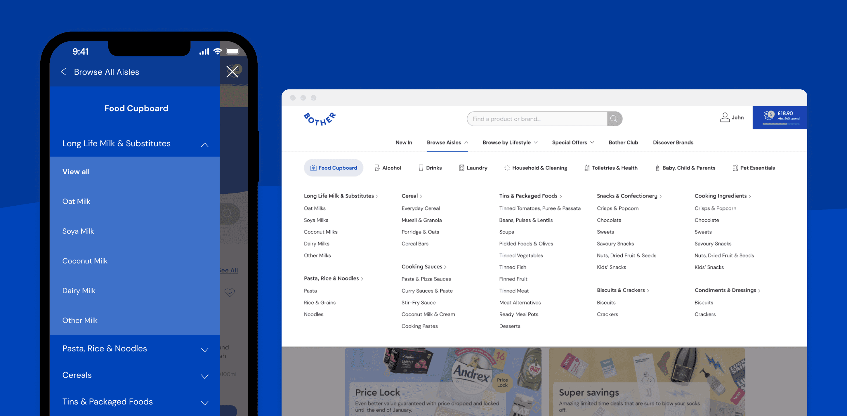
After a survey with customers, and a design audit—
—It was clear that the issue on desktop lay with having a category grid as an entry point.
The grid sent customers from a top line category (i.e. Laundry) right into a long list of products. For customers looking for specific products this was counter-productive and overwhelming.
Plus, the side-bar nav was inconsistent across category pages, making repeat use difficult.

Mobile's sub-category nav was even trickier to navigate as it required horizontal scrolling.
I collaborated closely with 2 engineers (mobile and desktop) and hosted solution sessions to generate ideas.
We quickly reduced our 30+ ideas into 3 strong design directions.
We then noted the riskiest assumptions around them (e.g. Does the layout feel familiar? Is it overwhelming?)—
And kept them top of mind as we then conducted usability tests for each direction.


Justin gets really engaged with all parts of business - trying to understand every challenge and constraint, and builds really strong relationships with the likes of marketing and commercial in the process.